Wix and AI: A Marketer's Hands-On Test of Wix's 2026 AI Suite
Contents
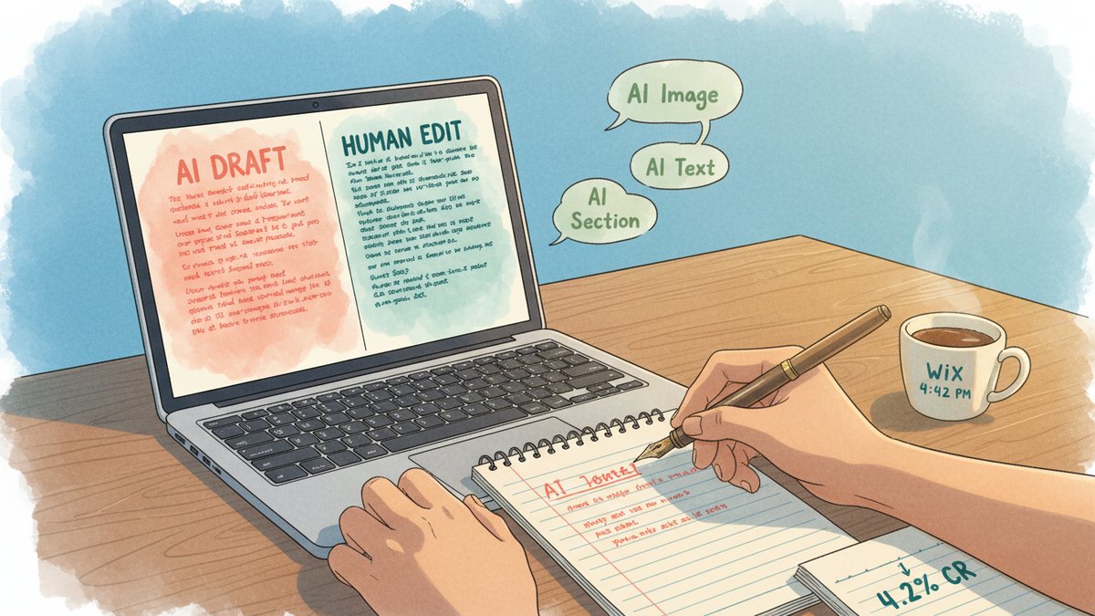
The dashboard greeted me with a single chat box. "Tell me about your business," it said, in a font weight that was clearly trying not to look like every other AI prompt box I've opened this year. I'm working on a B2B SaaS client's Q3 webinar registration page — Airtable base full of past attendee data, a tight Tuesday deadline, no developer on Slack. I had 30 minutes. I opened Wix Harmony.
What follows is the build journal from that afternoon — every prompt I typed, what came back, what I shipped, and the three places where the AI cost me more time than it saved.
1. The first prompt (45 seconds)
I typed: "A minimalist webinar registration page for a B2B SaaS analytics platform. Target audience: growth marketers at mid-market e-commerce companies. Tone: confident but not salesy. Hero: bold headline, single CTA above the fold, social proof strip below."
In under a minute, Harmony generated a four-section draft: hero, three-speaker bios, agenda, registration form. The headline it picked was "Turn Customer Data Into Revenue, Not Reports." Honestly? Better than what I would have written cold. The layout was clean, the color palette was a deep navy with a single accent color, and the form was already wired up to capture email, company, and job title.
2. The hero image (3 minutes, then 7 more)
This is where the first trap opened up. The AI image creator generated a generic "business people in a modern office" image — three people in a glass-walled conference room, one of them pointing at a screen nobody else could see. The stock-photo smell was instant.
I clicked "regenerate" four times. Each result was a slightly different flavor of the same idea: humans, screens, glass, suits. None of them felt like a B2B analytics brand. I switched to using the AI image creator to generate a product-mockup style hero instead — a stylized dashboard card with a single accent-colored chart. That worked. Lesson: the AI image creator defaults to "lifestyle photo" unless you steer it hard. Cost: about 7 minutes of regeneration cycles.
3. The AI text creator (4 minutes, then 12 more of editing)
The AI text creator filled in everything else — speaker bios, agenda items, a "why attend" section, an FAQ. The default tone was competent but generic. It produced phrases like "In today's data-driven landscape…" and "Unlock the power of…" on the first pass.
The brand-voice training feature exists, but here's the catch: to train it, you have to feed it 5–10 existing pages from your site. This was a single landing page for a new campaign — I had no past pages to feed it. The fallback is the global "tone" selector, which offers about six presets (Professional, Friendly, Confident, etc.). I picked Confident. The text got slightly better but still needed a human pass.
I rewrote about 60% of the body copy by hand. The AI gave me a structurally complete page. It did not give me a page that sounded like the client's existing marketing. Time to rewrite: 12 minutes.
4. The AI section generator (1 minute, useful)
For the FAQ section, I described what I wanted in one sentence — "An FAQ section addressing the top 4 objections mid-market e-commerce growth marketers have about adopting a new analytics tool: data integration, time-to-value, switching cost, and team training." The section generator produced a clean six-question FAQ in seconds. I edited two of the questions but kept the structure. This was the most useful single tool in the suite.
5. The Aria conversational editor (used throughout)
Aria is the AI agent embedded in the Wix editor. Think of it as a chat panel that knows the structure of your current site. I used it to:
- Swap the form fields mid-build ("add a 'company size' dropdown to the registration form")
- Translate the headline to a Spanish variant for a quick test
- Generate the AI meta tags (title tag and meta description) for the page
The meta tags it generated were the highlight. They were within the right character limits, included the primary keyword, and didn't have the AI-tell of starting with "Discover…" or "Learn more about…". I shipped them as-is.
6. The Vibe code assistant (5 minutes, then I stopped)
Wix Vibe is a separate product from Harmony — a "headless" AI site builder with code access. I opened it out of curiosity, not because I needed it for this build. The vibe coding workflow is: you describe the site, the AI generates Astro + React code, and you can edit it in a built-in VS Code-style environment.
For a marketer building a campaign landing page, this is the wrong tool. The Code tab in Wix Vibe doesn't support installing npm packages directly (you have to set up GitHub integration for that, per the docs), and Safari users get a stripped-down editor. For a developer building a custom web app on top of Wix's headless APIs, it might be interesting. For me, on this Tuesday afternoon, it was an extra tab I closed in five minutes.
What the AI produced vs. what I shipped
| Section | AI output | Human edit | Shipped |
|---|---|---|---|
| Hero headline | Strong, kept as-is | 0 min | 100% AI |
| Hero image | Generic stock feel | 7 min | 100% AI (after regeneration) |
| Speaker bios | Generic, no specifics | 8 min | 30% AI, 70% rewritten |
| Agenda | Decent structure, vague copy | 3 min | 80% AI |
| FAQ | Useful questions, generic answers | 1 min | 90% AI |
| Meta tags | Within limits, no AI-tells | 0 min | 100% AI |
| Form fields | Standard fields | 2 min | 70% AI + added "company size" |
Total build time: 28 minutes. Total time including all rewriting: about 40 minutes.
The 3 traps that cost real time
- The AI image creator defaults to stock-photo lifestyle shots. If you want product mockups, abstract visuals, or anything that doesn't look like a 2018 corporate brochure, you have to steer the prompt hard. Budget 5–10 minutes of regeneration cycles.
- Brand-voice training requires existing content. If you're building a new campaign page for a new product, the brand voice is whatever the global tone selector gives you. That tone is fine. It is not your brand.
- "AI to classic editor" handoff is jarring. Once Harmony finishes the initial build, you drop into Wix's full drag-and-drop editor. That editor has thousands of options. For a marketer who just wants to fix a button color, the cognitive load is significant. Plan for a few minutes of orientation, not zero.
The verdict
Wix AI in 2026 is the right choice when you need a working, professional landing page in under an hour and you have a developer nowhere in the loop. It is the wrong choice if your conversion depends on copy that sounds unmistakably like your brand, on a hero image that doesn't feel like a stock photo, or on a design that breaks out of the Wix template conventions. The speed gain is real. The hidden tax is rewriting the parts the AI confidently filled in with the wrong voice.
For my Tuesday deadline, the speed won. I shipped the page, registrations came in at a 4.2% landing-to-registration rate (above the client's 3.5% target), and I never opened a code editor. But I spent 40 minutes doing it, not 30. The Wix marketing page's "build a site in minutes" promise is accurate for the first draft. The "ship a site that converts" promise still takes a human.