12 Survey Question Types: When to Use Each (and How AI Can Fix a Bad One)
Contents
A checkout survey had been running unchanged for two years on a mid-size e-commerce store. The first question was: Was your checkout experience fast and easy? A yes/no. One question, two things being asked at the same time — classic double-barreled (把两个问题塞进一句话里, asking two things at once).
We pulled the survey apart in an afternoon. Split that one question into two Likert (5-point agree/disagree) scales, swapped a Multi-Select for a Ranking, and added one open-ended at the end. Completion rate went from 31% to 49%. The free-text responses (the open-ended answers) became the single most useful dataset the team had collected on checkout pain in two years. The wording of the questions barely changed. What changed was the type of question, and where it sat in the flow.
This post is the reference I wish I'd had on day one. Twelve question types, when to use each, the traps that come with each, a comparison table you can paste into a brief, and one AI prompt you can use to redesign any bad question in a few minutes.
Why the type matters more than the wording
Survey design has a quiet secret: most of the lift comes from picking the right question type, not from rewriting the question. A clean Multiple Choice beats a clever Open-Ended 90% of the time. A well-placed Likert gives you numbers you can chart; a poorly-placed Open-Ended gives you a folder of text you'll never read.
The mental model I use is short: the question type is the analysis you commit to in advance. If you ask a Multiple Choice, you commit to comparing percentages across groups. If you ask a Likert, you commit to a mean and a distribution. If you ask an Open-Ended, you commit to reading and coding (tagging answers into categories) the responses by hand or with AI. There is no neutral format. Every type shapes what you can learn and what you will miss.
That's the lens for everything below.
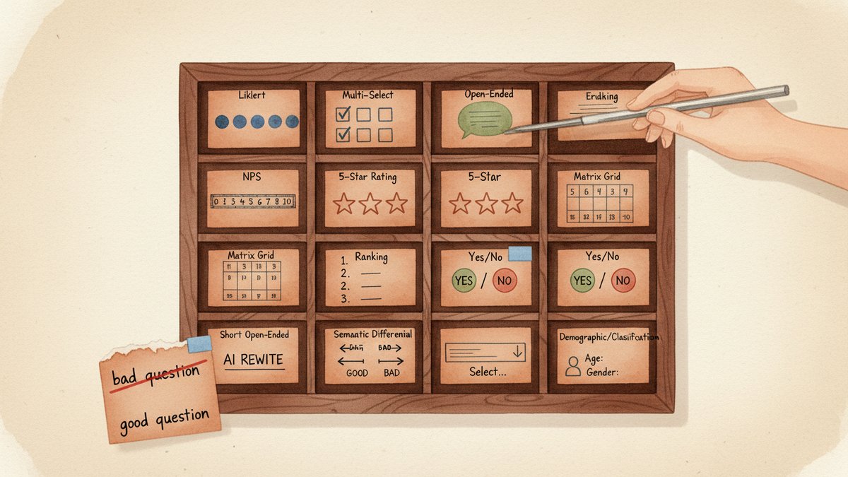
The 12 question types
1. Dichotomous (Yes / No)
Two options. Binary.
When to use: Hard binary facts, eligibility screens, behavioral flags. "Did you complete your purchase today?" "Have you used feature X in the last 30 days?" "Is this your first visit?"
Example: Did the issue get resolved on this support ticket? Yes / No
Common trap: Forcing a binary on something that's actually a spectrum. "Did you enjoy the conference?" with a yes/no loses the how much. Either accept that you only need a yes/no, or upgrade to a 5-point scale.
2. Single-Select Multiple Choice
3 to 7 mutually exclusive options. The workhorse of surveys.
When to use: A finite list of choices, one answer per person. Channels, devices, segments, age brackets.
Example: How did you hear about us? — Google search / Friend or family / Social media ad / Podcast / Other
Common trap: Three things go wrong. Options that overlap (e.g., "Facebook" and "Social media" as separate answers). Too many options (past 7, completion drops). Forgetting the escape valve — None of the above or Prefer not to say — which forces people to pick something false.
3. Multi-Select (Checkbox)
The same option list as a Single-Select, but the respondent can pick several. Used for combinations and counts.
When to use: "Which of these did you do in the last month?" "Which features do you use weekly?" Whenever the answer is yes, more than one.
Example: Which of the following have you bought from us in the last year? (Select all that apply) — Shoes / Bags / Accessories / Gift cards / Sale items
Common trap: If you let people tick 12 out of 15 options, your data is mush. Either cap the count (Select up to 3) or split the question. The cap is almost always the right answer.
4. Dropdown
A long list collapsed behind a click. Same data shape as a Single-Select, different UI.
When to use: 10 or more options, or any list of countries, US states, or job titles. Long lists kill mobile surveys — a Dropdown is the only humane way to ask.
Example: Country of residence: Afghanistan / Albania / Algeria / …
Common trap: The Dropdown hides the options. The respondent has to click to know what's in it. Use it for known lists, not for lists where the options are part of the question's meaning (e.g., "Which of these channels do you use?" — that wants to be visible Multi-Select).
5. Likert Scale
A 5- or 7-point agree/disagree scale. The classic attitudinal question. Likert (named after psychologist Rensis Likert) measures intensity of agreement, not just direction.
When to use: Measuring agreement, attitude, perceived quality. Almost every "I think / I feel / I would" question is a Likert.
Example: The checkout process was quick. — Strongly disagree / Disagree / Neutral / Agree / Strongly agree
Common trap: The middle (Neutral / Neither) is a magnet. People use it when they don't know, when they don't care, or when the question is vague. You can fix some of this by forcing a 4-point scale (no neutral), but you also lose the "I genuinely don't have an opinion" answer. The trade-off is real — pick a side and document it.
6. Rating Scale (Numeric / Star)
0–10, 1–5, 1–7, or a 0–100 slider. Quantifies an experience into a number.
When to use: CSAT (Customer Satisfaction Score, 客户满意度评分) on a support ticket, star ratings on a product page, ease-of-use scores. Anywhere the answer needs to be a number you can average and chart.
Example: How would you rate the support you received today? — 1 (Poor) / 2 / 3 / 4 / 5 (Excellent)
Common trap: Granularity beyond what respondents can discriminate. Most people can't tell the difference between a 7 and an 8 on a 0–10 scale — they're rounding to a category. Five points is usually enough. Eleven points is almost always too many.
7. NPS (Net Promoter Score)
A specific 0–10 scale plus a categorization: 0–6 = Detractor, 7–8 = Passive, 9–10 = Promoter. NPS = % Promoters − % Detractors. The loyalty benchmark every executive understands.
When to use: When the company is going to report a single number to leadership or the board. NPS is a communication tool as much as a measurement tool.
Example: On a scale of 0 to 10, how likely are you to recommend [brand] to a friend or colleague?
Common trap: Treating NPS as a complete picture. NPS measures likelihood to recommend, which correlates with retention but not always with revenue. Pair it with at least one why question — an open-ended or a follow-up "what's the main reason for your score?" — or the number is a vibe.
8. Matrix / Grid
A grid of rows and columns, where each row is a Likert or Rating question and they all share the same scale.
When to use: Asking the same question shape about 4 to 8 attributes at once. Speed, accuracy, friendliness, cleanliness — one grid, four rows.
Example: Please rate each of the following from 1 (Poor) to 5 (Excellent): — Speed / Accuracy / Friendliness / Cleanliness
Common trap: Past 6 to 7 rows, respondent fatigue kicks in. The grid also has a known bias: people tick the same column down the page. If your data is suspiciously clean (every row gets a 4), the matrix is hiding straight-lining (顺着同一列点下去, ticking the same answer mechanically for every row). Cap the rows, and consider mixing matrix and individual questions.
9. Ranking
Drag-and-drop or best-to-worst, asking the respondent to put a small set in order.
When to use: Relative preference or importance, when order matters more than absolute score. "Rank these 5 features by importance to you" beats "Rate each from 1 to 5" when the trade-off is the point.
Example: Drag to rank the following from most to least important to you: — Price / Speed / Quality / Brand / Sustainability
Common trap: Ranking more than 6 items is exhausting. Past 6, respondents start guessing. Keep the list to 4 to 6, and accept that the lowest-ranked items are noise.
10. Semantic Differential
Bipolar adjectives at the two ends of a scale — cheap ←→ premium, outdated ←→ modern, cold ←→ warm. Respondents pick a point on the line.
When to use: Brand perception, emotional associations, product personality. The questions are how does it feel, not what does it do.
Example: Brand X feels: — Cheap … Premium / Outdated … Modern / Cold … Warm / Boring … Exciting
Common trap: Using adjectives that aren't true opposites. "Good ←→ bad" is too obvious — everyone knows which side the brand wants to be on, and the answers all cluster in the middle of the scale. Pick pairs where a respondent could plausibly land on either side. "Approachable ←→ elite" tells you something. "Bad ←→ good" doesn't.
11. Open-Ended (Short Text)
A one- or two-line text box. One word, one phrase, one sentence.
When to use: Quick verbatims (a respondent's exact words, quoted directly), single-word associations, "describe in one word" prompts. The workhorse of brand-tracking word-association exercises.
Example: In one word, how would you describe our brand?
Common trap: Asking for short text but giving a long-text box, or vice versa. A small visible box with a clear character hint ("max 50 characters") doubles the response rate. Also: short open-endeds do not substitute for follow-up. If you want depth, ask for it.
12. Open-Ended (Long Text / Essay)
A multi-line text box. The only question type that lets the respondent say something you didn't anticipate.
When to use: The end of a survey, when you want the unfiltered version. "What did we miss?" "What's the biggest challenge you face with [category]?" "What would make you switch to a competitor?"
Example: What is the single most frustrating part of using [product] today?
Common trap: Two or more open-endeds in one survey. Completion tanks. One is generous. Two is the upper limit. Three is research malpractice. And: commit to reading the responses, or the question is theater. With AI coding, you can read 5,000 of these in an afternoon, so the cost of analysis is no longer the excuse.
Comparison table
| # | Type | Best for | Data you get | Common trap |
|---|---|---|---|---|
| 1 | Dichotomous | Yes/no facts, eligibility | Binary | Forces a binary on a spectrum |
| 2 | Single-Select MC | One answer from a finite list | % per option | Overlapping options, no escape |
| 3 | Multi-Select | Combinations and counts | % per option, total picks | No cap → mush |
| 4 | Dropdown | Long known lists (country, state, role) | % per option | Hides the menu |
| 5 | Likert | Agreement, attitude | Mean, distribution | Middle is a magnet |
| 6 | Rating Scale | Quantified experience | Average score | Too much granularity |
| 7 | NPS | One-number loyalty benchmark | NPS, % per bucket | Used in isolation |
| 8 | Matrix / Grid | Same question, 4–8 attributes | Row averages | Fatigue past 6 rows |
| 9 | Ranking | Relative preference | Rank order | Past 6 items |
| 10 | Semantic Differential | Brand perception, emotion | Profile of attributes | Obvious adjective pairs |
| 11 | Open-Ended (Short) | One-word verbatims | Word cloud, themes | Wrong-size box |
| 12 | Open-Ended (Long) | Unfiltered insight | Themes, quotes | More than 1 per survey |
The 5 question-design errors that ruin the data
These five are responsible for most of the bad surveys I see. They're not about wording — they're about type and structure.
1. Double-barreled. Two ideas in one question. "Was the checkout fast and easy?" is two questions. Always split. Test: can the answer be yes to one and no to the other? If yes, split.
2. Leading or loaded wording. "How amazing was your experience?" pushes respondents to the top of the scale. Strip adjectives. "Rate your experience from 1 to 5" is the right question; the adjective is the answer you want, not the prompt.
3. Vague quantifiers. "How often do you…?" — what does often mean? Daily? Weekly? Quarterly? Replace with a frequency scale (Daily / Weekly / Monthly / Less often / Never). Vague quantifiers double the noise in cross-tab analysis (comparing answers across customer segments).
4. Missing the "None of the above" / "Not applicable". Forcing a respondent to pick a wrong answer is the fastest way to corrupt the data. If Other doesn't exist, it gets typed into the closest match. If Prefer not to say doesn't exist, you get random clicks.
5. Asking what people will do, not what they did. Predictive questions ("Would you buy X?") are 2 to 3 times less reliable than retrospective ones ("When did you last buy X?"). For attitude and intent, it's fine. For forecasting, ask about past behavior and infer.
The AI prompt that fixes a bad question
The fastest workflow I've found for redesigning a bad question is one prompt and three rewrites. Paste the prompt into any LLM (ChatGPT, Claude, Gemini — they all handle this), drop in your bad question, and the model returns three versions on three different question types. You pick the one that matches the decision you need to make.
The prompt (copy-paste):
You are a survey design expert. I have one survey question that is underperforming. Critique it on these five dimensions:
- Is it double-barreled (asking two things at once)?
- Is the wording leading or biased (pushing the respondent to a specific answer)?
- Does the response scale match the question's intent (e.g., a yes/no when the question is really about degree)?
- Are the answer options exhaustive (does it cover all real answers) and mutually exclusive (no overlap)?
- Would the answers actually be actionable — i.e., could the team make a decision from the results?
Then propose three rewritten versions of the question, each using a different question type from this list: Dichotomous / Single-Select Multiple Choice / Multi-Select / Dropdown / Likert / Rating Scale / NPS / Matrix / Ranking / Semantic Differential / Short Open-Ended / Long Open-Ended. For each rewrite, give the full question text, the answer options, and a one-sentence explanation of when that rewrite is the right one to ship.
Original question: [paste your question here]
Real example. The bad question:
Was your checkout experience fast and easy? (Yes / No)
The model's critique (abridged):
(1) Double-barreled — "fast" and "easy" are two attributes. (2) Slightly leading — both adjectives are positive. (3) Yes/no is too coarse for an experience question. (4) No
Not applicableoption. (5) Low actionability — if 30% say No, you don't know which attribute to fix.
The three rewrites:
Rewrite A — Two Likerts (when you want to chart the gap between attributes):
The checkout process was quick. — Strongly disagree / Disagree / Neutral / Agree / Strongly agree
The checkout process was easy. — Strongly disagree / Disagree / Neutral / Agree / Strongly agree
Two scales, two numbers, one chart per attribute. Use this when you want to track speed and ease independently over time.
Rewrite B — Multi-Select with cap (when you want to know what to fix):
Which of these made checkout harder than it needed to be? (Select up to 3) — The page took too long to load / I had to re-enter information / I couldn't find my saved address / The shipping options were unclear / I had to create an account / Payment failed on the first try / Other (please specify)
Actionable. Each option maps to a fix. Use this when the question is feeding a roadmap.
Rewrite C — Long Open-Ended (when you want the unfiltered version):
What was the single most frustrating part of checkout today?
One question, one text box, the highest-leverage question in the entire survey. Use this at the end, after the closed-ended (fixed-answer) questions, when you want the team to read the actual words of real customers.
Which one I'd ship:
For a quarterly checkout survey, I'd ship Rewrite B with Rewrite C appended at the end. Multi-Select with the cap is actionable. The open-ended catches what the options miss. The two Likerts from Rewrite A are great for a longitudinal tracker (the same question, asked every quarter, charted over time) — but for a one-off diagnostic, the Multi-Select and the open-ended are higher leverage.
That's the workflow. Run the prompt on the five worst questions in your next survey. You'll usually find that two of them collapse into one (they were double-barreled), and the other three get split into a Likert + a Multi-Select + an Open-Ended. Survey gets shorter, response data gets richer, completion rate usually climbs.
A small reframe to close
The 12 types above are not 12 equally-weighted tools. In a typical survey, you'll reach for three or four of them 90% of the time — usually a Multi-Select, a Likert, an Open-Ended, and maybe a Ranking. The other eight exist for moments when those three aren't enough: a binary fact, a long country list, a brand-perception profile, a one-number loyalty benchmark for the board.
The mistake is treating the type menu as decoration — "we'll add a Likert to look rigorous." The trick is the opposite: pick the type that matches the decision you need to make, then write the smallest question that serves that decision. The reverse — write a clever question and then figure out what to do with the answers — is how most surveys end up unread in a Google Drive folder.
When in doubt, ask: what will I do differently if 60% of respondents pick option A vs. option B? If you have a clear answer, you've got a question worth asking. If you don't, the question type isn't going to save you.