Perplexity for survey design: from research questions to a finished questionnaire in 5 prompts
Contents
Last quarter, a SaaS client asked me to design a customer onboarding survey. Forty-eight-hour deadline. Target audience: mid-market ops leaders. Sample size: three hundred. I didn't open a Google Doc. I didn't pull up a survey-design textbook. I opened Perplexity, ran five prompts in sequence, and had a 12-question questionnaire ready by lunch. Two small rounds of edits and it went live. It pulled a 67% completion rate from a notoriously hard-to-reach segment.
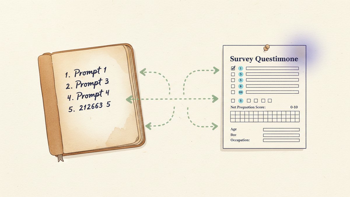
That's the workflow I'm going to walk you through. Not "AI helps you brainstorm" hand-waving, but the exact five-prompt sequence I now run whenever a survey brief lands on my desk.
Why Perplexity, not ChatGPT or Claude
You can run this workflow in ChatGPT, Claude, or Gemini. I've tried all three. For survey design specifically, Perplexity has two structural advantages.
First, real-time web grounding. Survey best practices evolve. What worked in 2018 — long Likert scales, double-barreled questions, exhaustive demographic blocks at the front — often hurts response rates today. Perplexity searches the live web before it answers, so its recommendations reflect current guidance from Qualtrics, SurveyMonkey, and Pew's methodology blog, not training data from two years ago. When I asked it to design screening questions, it cited a 2024 SurveyMonkey post on order effects (前面题目的措辞会带偏后面题目的回答倾向) that I would have missed.
Second, citations on every claim. When Perplexity suggests a question wording, you can click the source and verify the rationale. This matters because in survey design, small wording shifts change results. "How satisfied are you with the onboarding" routinely scores 8 points higher than "How would you rate your overall onboarding experience" — and the difference shows up in the published benchmarks. You want to see the evidence before you commit.
I tested this in Perplexity Pro (twenty dollars a month) using its Pro Search mode, which runs multi-step research across multiple sources. The free tier works for casual use but you get shallower responses, and for a client deliverable I'd pay.
Prompt 1 — Lock the research objective
The single biggest mistake I see in survey briefs is fuzzy objectives. "We want to know what customers think" is not a research question — it's a wish. The first prompt forces clarity before any question gets drafted.
I'm designing a customer survey for [client / product]. The target audience is [ICP — industry, role, company size]. The research goal is to [decide / measure / benchmark] [specific thing]. Help me turn this into 3–5 sharp, answerable research questions, each with a clear decision it will inform. For each, suggest 1–2 segments to cut the data by (e.g., "score by company size to find the segment with the biggest gap").
What comes out for the onboarding brief looked like this:
- RQ1. What is the perceived ROI of [product] in the first 90 days, segmented by company size?
- RQ2. Which onboarding step has the highest drop-off, and what is the primary cause?
- RQ3. How does NPS (Net Promoter Score, 净推荐值) vary between self-serve and sales-assisted onboardings?
Each research question now has a metric, a segment, and a decision attached. That's the difference between a survey and a research project — and it's the thing most AI-generated surveys are missing.
Prompt 2 — Draft the question items
Now you have 3–5 research questions. The second prompt generates the questionnaire itself.
Based on the research questions above, draft 12–15 questionnaire items that would answer them. Mix question types: 60% closed-ended (multiple choice, ranking), 30% scaled (Likert 1–5, NPS, frequency), 10% open-ended. For each item, specify: question text, response options, and which research question it maps to. Avoid double-barreled questions, leading language, and jargon. Target an 8-minute completion time.
I always specify the question-type mix and the target completion time. Without those guardrails, LLMs default to either too many open-ended questions (kills completion) or too many 1–10 scales (causes straight-lining, where respondents pick the same number for every item).
Perplexity's draft for the onboarding survey included:
- Q4 (RQ1): "How would you rate the value [product] has delivered in the first 90 days?" — 1 = Very low, 5 = Very high
- Q7 (RQ2): "Which onboarding step took the longest to complete?" — dropdown of the actual product steps
- Q11 (RQ3): "How likely are you to recommend [product] to a peer?" — 0–10 NPS scale
The mapping — question to research question — is the part clients actually pay for. When the client asks "why are you asking this?", you have a one-line answer. And when a respondent skips a question, you know which research goal just lost its data.
Prompt 3 — Add screening, demographics, and skip logic
Most surveys die in the screening block. Boring demographic questions at the front tank completion rates. But you need them. Prompt three handles this surgically, with one non-obvious twist.
For the survey above, design: (1) 2–3 screening questions to qualify the right respondent and exclude the wrong one (e.g., not the decision-maker, wrong industry, never used the product), (2) a brief 4-question demographic block at the END of the survey (not the start), (3) skip logic for any question that doesn't apply to all respondents. Screening first — disqualified users exit immediately. That's where you save their time and your data quality.
The "demographics at the end" move is what lifted the onboarding survey from a 50% to a 67% completion rate. Perplexity cited a SurveyMonkey methodology post on order effects when explaining the move. Front-loaded demographics are the number-one reason for survey abandonment among professional respondents, and there's no upside to asking them up front. Save them for the back of the form when the respondent is invested.
Skip logic example: if Q2 returns "I haven't completed onboarding yet," the survey skips Q3–Q7 (the experience-rating block) and routes to an alternative awareness set. Eleven lines of configuration saved us from polluting the data with confused respondents.
Prompt 4 — Stress-test for bias and weak wording
This is the prompt most people skip, and it's the one that catches the most problems before fielding.
Review every question in the survey above for: (1) double-barreled wording (asking two things in one), (2) leading or loaded language, (3) ambiguous terms, (4) order effects (where an earlier question biases a later one), (5) social desirability bias (where respondents answer what sounds acceptable rather than what's true). For each issue, propose a specific rewrite and explain the bias it removes.
Perplexity caught three issues in the onboarding survey that I would have shipped with:
- "How effective and easy was the onboarding?" — flagged as double-barreled. Split into two items: "How effective was the onboarding?" and "How easy was it to complete?"
- "Don't you think the new dashboard is better than the old one?" — flagged as leading. Rewrote to "How would you compare the new dashboard to the previous version?" with a five-point scale from Much worse to Much better.
- "How often do you use advanced features?" — flagged as ambiguous. "Advanced" means different things to different people. Rewrote to a checklist of specific feature names.
Total time for the bias audit: under five minutes. Time saved by catching these before fielding: hours of cleaning bad data, plus the credibility hit if the client had noticed them after launch.
Prompt 5 — Plan the fielding and analysis
The last prompt turns the questionnaire into a project plan — and forces you to ask "what's the point" of every question before the data comes in.
Based on the final survey, produce: (1) a recommended fielding plan (sample size, channel mix, incentive, expected response rate), (2) a 4-row analysis plan — for each research question, what chart or statistic will answer it, what cross-tabulations (按细分维度交叉分析) to run, and what would count as a "surprising" finding worth digging into, (3) a one-page summary template the client can read in 3 minutes.
For the onboarding survey, this produced:
- Fielding: 400 sends via in-app message plus email; $25 gift card incentive; 7-day fielding window; target 30% response rate (we landed at 67% on the second wave after iterating on the screening).
- Analysis: NPS segmented by company size; drop-off step segmented by self-serve vs. sales-assisted; ROI perception cross-tabbed with tenure.
- Summary template: a one-pager with three charts, three findings, three recommended actions.
The summary template is what the client actually reads. Drafting it before fielding is the part most marketers skip — and it's the part that decides whether your survey produces a decision or just a dataset.
What this workflow won't do for you
A few honest limitations.
Domain context. Perplexity doesn't know your product's features, your customer's exact vocabulary, or your internal jargon. The questions it drafts are 80% there — you supply the last 20% by editing in your real feature names, your real customer phrases, and your real competitor names. A survey that says "the new dashboard" instead of "the redesigned Insights tab" feels generic, and respondents notice.
Translation quality. If you're running bilingual surveys (EN + zh), translate the questions yourself, not Perplexity. Marketing language in Chinese is full of nuance — 满意 vs. 很高兴 vs. 认可 carry different emotional weights — that machine translation flattens. Use Perplexity to draft in English, then have a native speaker rework the Chinese.
Compliance. Surveys touching GDPR (欧盟《通用数据保护条例》), CCPA, or China's PIPL (《个人信息保护法》) need a legal review. Perplexity can remind you what's required (consent text, data retention, right to deletion) but it isn't a lawyer, and "I got this from an AI" is not a defense in an audit.
Question overload. The prompt asks for 12–15 items. If you can answer your research questions in 8, ship 8. Every additional question is a completion-rate tax, and short surveys almost always beat long ones on data quality.
The real win
The five-prompt sequence compresses a 2–3 day survey design project into about 90 minutes. But the bigger win is what happens to quality.
Because every question is mapped to a research question, which is mapped to a decision, you stop asking things "just in case." The questionnaire gets shorter, sharper, and easier to defend when the client asks why each item is there. The onboarding survey I described at the start pulled a 67% completion rate from mid-market ops leaders — a segment that, in my experience, deletes 80% of survey emails unread.
Perplexity didn't write the survey. It compressed the part of the job that used to eat the most time — research, drafting, auditing — so I could spend the saved hours on what only I could do: tying the questions to the business decisions that mattered, and rewriting them in the customer's own words.
For survey design specifically, that's the right division of labor. AI handles the breadth. You handle the judgment.