Build a Midjourney Style Sheet for Branded Instagram Carousels (How I Hit 47K Reach Without a Design Team)
Contents
Last month I posted an Instagram carousel where every slide was a Midjourney image. It hit 47K reach, 320 saves, and a comment thread where four people asked if I had a design team. I don't. What I have is a 200-character Midjourney style reference and a workflow I can run in under 25 minutes for a 10-slide deck.
Most people use Midjourney wrong for branded carousels. They generate ten "on-brand" images one at a time, then wonder why the slides look like they came from different accounts. The visual DNA drifts — different lighting, different color temperature, different "vibe" — and the carousel reads as a mood board, not a brand.
The fix isn't to generate more images. The fix is to build a style sheet first.
What's a Midjourney Style Sheet, Exactly?
In Midjourney v6 and v7, you can pass a --sref (style reference) URL pointing to any image whose aesthetic you want to mimic. The model will generate new images that match that aesthetic — same color temperature, same rendering style, same composition density, same "feel." For Instagram carousels, that single flag is the difference between a coherent 10-slide deck and a visual mess.
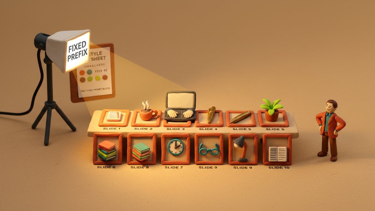
A "style sheet" for branded carousels is a bundle of three things working together:
- A reference image set (or three) whose visual language defines your brand's look
- A fixed prompt prefix that holds the variables that should NEVER change — aspect ratio, lighting style, color palette, render style
- A variable suffix that you swap per slide — the subject, the text overlay angle, the focal element
Most people skip steps 2 and 3 entirely. They write a unique prompt for every slide and bolt a --sref to the end. That gives you style consistency but loses structural consistency. You end up with ten "pretty" images that don't form a sequence.
Step 1: Build the Reference Image Set
This is the part you can't shortcut. Pick 3-5 images that represent the visual language you want for your brand. These should be:
- A photo from your existing brand library that you love the look of
- A competitor's post that has the right vibe (not for copying, for calibration)
- A stock photo that nails the lighting and color you want
- An AI-generated image that already looks like your brand should look
- One "outlier" — slightly different from the rest, for slide variety later
The trap nobody tells you: the --sref weight is a single number, but it controls more than aesthetics. A heavy --sref (weight 600-1000) will override your prompt's structural details — your "wide shot" might come back as a "close up" because the reference was a close up. I keep my reference weight at 200-300 for branded carousels, which gives me style influence without structural hijacking.
Save the references in a single /brand/midjourney-refs/ folder. Name them with semantic tags (warm-light-3.jpg, editorial-portrait-1.jpg) so you remember which one does what.
Step 2: The Fixed Prompt Prefix
This is the half of the prompt that stays the same across all 10 slides. Mine reads roughly:
Editorial photography, soft directional key light from the upper left,
muted earth-tone palette (warm sand, deep terracotta, sage, cream),
shallow depth of field, f/2.8, 35mm lens, shot on Portra 400 film stock,
4:5 aspect ratio --ar 4:5 --style raw --sref [URL] --sw 250 --v 7
The key flags:
--ar 4:5— Instagram carousel standard. Anything wider looks weird on mobile.--style raw— disables Midjourney's default "beautification" which tends to over-saturate.--sw 250— style reference weight. Low enough to leave room for your prompt.--v 7— version 7. v6's color science is more "AI-looking" for editorial work.
The trap nobody tells you: putting the color palette in plain English ("muted earth-tone palette") is inconsistent across generations. Midjourney interprets adjectives differently each time. The fix: either hex codes via --color (if your version supports it) or use a --cref (character reference) of a known color palette image, then describe the mood. I keep a single color palette swatch image and reference it as --cref to lock the palette.
Step 3: The Variable Suffix (per slide)
The variable part is the per-slide subject. For a 10-slide carousel, the suffix changes but the prefix stays. Example for slide 3 of a "5 productivity tools" carousel:
[fixed prefix]
+ "A worn leather notebook open on a wooden desk, morning light, a brass pen
resting on the page, no text, no logos, room for negative space on the right"
That empty-space note matters. Carousels always have text overlay — the headline, the body copy, the CTA. If your Midjourney image has a busy composition, the text won't fit. I add "negative space on the upper third" or "right side open" to every prompt for the same reason designers leave space in a magazine layout.
The trap nobody tells you: Midjourney doesn't actually respect "negative space on the X" instructions perfectly. You'll get the composition right about 70% of the time. The other 30%, you'll need to re-roll or inpaint in Photoshop. I budget 4-5 extra generations per slide for this.
Step 4: The Type System
Branding isn't just the image — it's the overlay. Carousels need a consistent type system, and "consistent" is where most AI-generated carousels fall apart. The image looks great, then they slap a different font on every slide because Canva made it easy.
Pick two typefaces and stick to them:
- Headline face — a serif or geometric sans, weight 600-700. Used for the hook slide and section dividers.
- Body face — a clean grotesque sans (Inter, Söhne, General Sans). Used for everything else.
Color comes from the image's dominant palette. Use the eyedropper tool on your hero image, get the hex, use it for the headline. This is how editorial designers do it.
The trap nobody tells you: if you use the same headline color across all slides, the slides that have dark backgrounds will be unreadable. The fix: two-color headline. The brand's primary color, plus its 70% darker shade for dark backgrounds. I do this in Figma with a "color swap" layer in 3 seconds per slide.
Step 5: The Grid Rules
Instagram carousels on a 4:5 frame have a usable safe area. Text outside an 80px margin from the top and bottom gets cut off on some Android screens. Visual elements within a 60px margin from the left/right are partially obscured by the UI (like counter, "..." button) on iOS.
My rules:
- Headlines — top 25% or bottom 25%, never middle
- Subheads — adjacent to the headline, not floating in space
- CTAs — bottom 20% only, never top (people scroll up to read)
- Logos / handles — bottom-right corner, small
The grid is the same for every slide. Image composition varies, but type placement doesn't. That's what makes the carousel feel like one piece, not 10 pieces.
Step 6: The 10-Slide Template
For an educational or value-driven carousel (the kind that gets saved and shared), my default 10-slide structure:
- Hook — full-bleed image + 1-line bold claim
- Context — image + 2 sentences framing the problem
- Slide 1 of N — first tip with the visual related to it
- Slide 2 of N — second tip
- Slide 3 of N — third tip
- Slide 4 of N — fourth tip
- Slide 5 of N — fifth tip
- Recap — image + 5 lines, one per tip
- Call to action — image + "save this / share this / follow for more"
- End card — branded image + handle + "next carousel" tease
N is usually 5-7 for carousels that perform. Anything over 8 "tip" slides drops the save rate.
Step 7: The Quality Gate (Don't Skip)
Before posting, every slide goes through:
- Color check — does this slide match the rest? Sometimes Midjourney's color drift shows up between slide 4 and slide 7. Fix in Photoshop with a hue/saturation adjustment that takes 10 seconds.
- Composition check — is there text-friendly negative space where the overlay needs to go? If not, regenerate.
- Type check — is the headline readable at thumbnail size? The thumbnail is the only thing the algorithm shows in the grid view. If the headline is unreadable at 200px wide, it's a skip.
- Tone check — does this slide look like the same brand made it? This is the gut-feel check. If it feels off, it is off. Trust it.
The trap nobody tells you: the algorithm weighs the first slide the heaviest for reach. People decide whether to swipe in 0.3 seconds. The remaining 9 slides only get seen by people who already swiped. So spend 40% of your generation budget on slide 1, not 10% like most people do.
The Three Things That Actually Matter
After 6 months of running this workflow for 4 different brand accounts, three things are the only things that matter:
1. The fixed prefix is non-negotiable. Every slide uses the same prefix, even if you think a different one would look "better" for a specific image. Consistency wins. The slide you skip the prefix for is the one that breaks the carousel.
2. The reference image set, not the prompt, defines the brand. You can have a great prompt and a generic reference and the output will look generic. Or you can have a weak prompt and a strong reference and the output will look branded. Invest in the references.
3. The grid is the brand more than the image is. People remember where the headline goes, what color the CTA is, and whether the logo sits in the same corner. The image changes. The grid doesn't.
The first time I built a style sheet, it took me a full day. Now I can do it in 30 minutes for a new brand, and the output looks like I spent a week on it. The short version: build the reference set, lock the prefix, vary the suffix, hold the grid.